Grand Potentate
Supporter of Possible Sexual Deviants
- Messages
- 39,182
Is that a casual friday look for the King?
Follow along with the video below to see how to install our site as a web app on your home screen.
Note: This feature may not be available in some browsers.
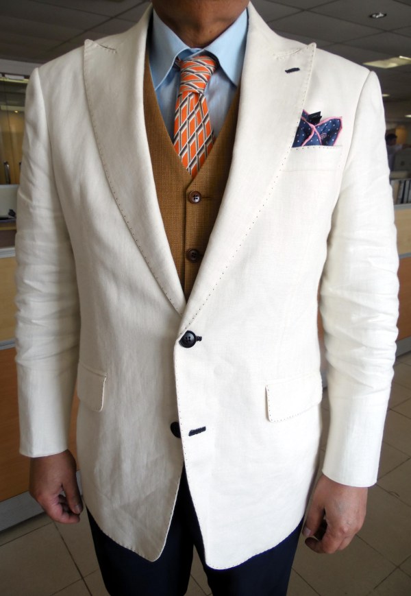

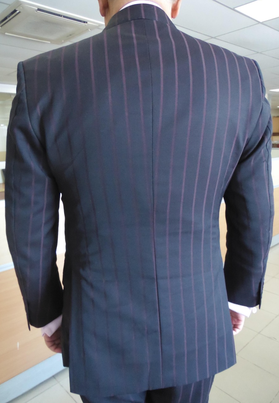
The navy db isn't too bad. What's going on with the right sleeve?
I'd like to believe this would look better were he not experiencing 98% personal humidity. Beyond the mysterious fabric warps, all is well in my book.The navy db isn't too bad. What's going on with the right sleeve?


I have a fondness for the low-overlap DB for some reason. I'm similarly puzzled by the ticket pocket.dig the fabric not the tie. any reason he would get a hacking ticket pocket. weird.
I love the colors on top, but the knit tie and vest is odd to me and the black bottom half is too stark.just no.
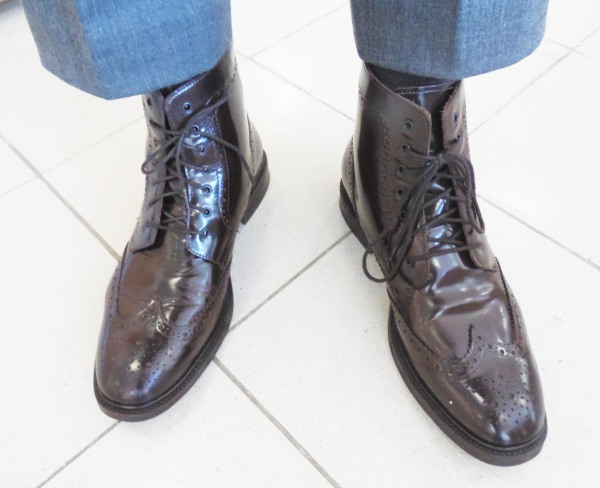
Weird coat button placement, that ticket pocket. I find the shoes too light and the pink pocket square does not play well with a scarlet striped tie in my book.
just no.
Holy shit! Que mierda es esa!
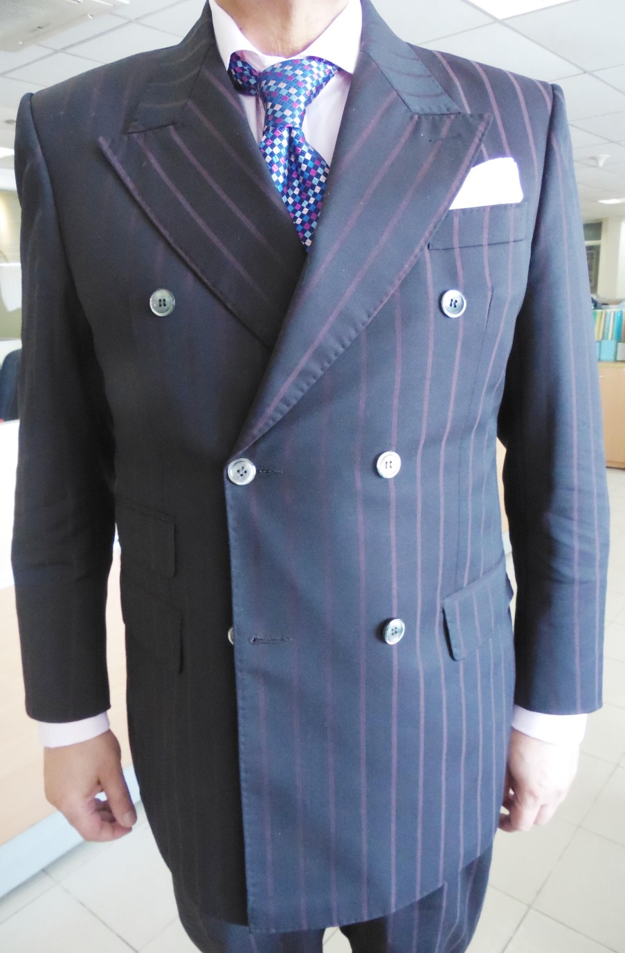
Anybody else here think his coat would look better as a 4X2 rather than a 6X2? And what's with the ticket pocket on the left side? That's a new one on me!
Anybody else here think his coat would look better as a 4X2 rather than a 6X2? And what's with the ticket pocket on the left side? That's a new one on me!


ripcord is cool just like bow tieI lol'ed at kotex string
I agree. If you don't pay attention to the uppermost buttons it looks rather nice as a 4x2
its niceit looks like a shiny cheap dinner suit
its nice
innit?
you eat like a pig
and throw away that poly z00t
the next one is ready from your sweatshop untailor
already!
pay some r00p33s
be happy
happy
happy
happy
are thos lyrics from bangladeshi song ?
it looks like a shiny cheap dinner suit
And come with MOP buttons!yes. shiny cheap dinner suits look best in 4x2


First one is horrendous. But I gotta admit, I kind of dig the 'old timey medicine man' thing he's got going on with the last 2.Been awhile: