
- Messages
- 40,417
This outfit should be burnedi like this vibe, very summery. Massive knot. would do away with the patterned shirt. seems like wonky sleeve buttons but there is always something.

Follow along with the video below to see how to install our site as a web app on your home screen.
Note: This feature may not be available in some browsers.
This outfit should be burnedi like this vibe, very summery. Massive knot. would do away with the patterned shirt. seems like wonky sleeve buttons but there is always something.

This outfit should be burned
I know, and I'm sorry, but that jacket/shirt/tie combo is just horrendous. It looks like something I'd see on the 90 year olds down here.Sigh, way to buzzkill my attempt to be a kindler, gentler DW member
I know, and I'm sorry, but that jacket/shirt/tie combo is just horrendous. It looks like something I'd see on the 90 year olds down here.


The two tone metal buttons are a very odd choice for that check, which is especially nice up close. He really needs to stop wearing patterns of such similar scale next to each other like the coat and shirt here. Contrast collar and french cuffs with a knit tie is a tad odd.
There may indeed be a historical regional fondness for metal jewelry and accoutrements.Is there a cultural proclivity for such flash that we don't get? We see tacky he sees sexy?

Considering what the man has to work with, he is indeed doing an utterly fantastic job. It's as if I was asked to recreate some native dress based on photos alone.i agree, he just has a shit tailor who probably can't do any better. I'm sure if he had access to a proper bespoke tailor he would look great.

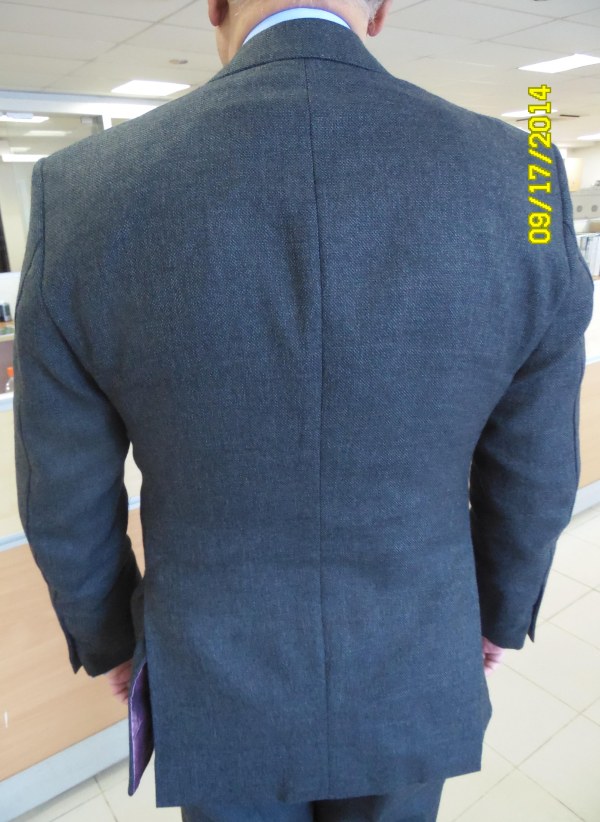
The coat fits better than usual. I can't get into checked coats with dark pants.
The pocket placement seems off again, I hate pocket squares over lapels, and I'm iffy on the (MOP?) buttons.
I do like his revival of the tab collar.
Oh geez, send Matt Deckard over to him and get the whole buttoned flapped pleated pockets and bi-swing back with half-belt and whatnot.
Actually, if one could ignore the old 16 oz. bias, the looser old-school stuff like that wouldn't be the dumbest idea for a warm climate.
Yes!

I'm starting to think he's partially color blind. He's got three different shades of pink there. Who in their right mind would try to match three different shades of the same color?
Societal implications of pink unknown, but nobody complains when he does lots of blue.


I never noticed that, but the collar does seem to climb too high.I like the lapels, but I am not sure if i like how he suit 'hugs' his neck.

Dammit King! Why can't you pull off a classic look without one of those mismatched pocket squares???

THIS. My watches take a terrible beating from all the explosions around Doom HQ.I actually like a good old beat to shit watch.
no joke this is the best look I've seen from him (tie, I'd go navy with white dots but that's just me). the lapels look like someone confused sharks-mouth with peak and split the difference.He is the king!
Look at those lapels!
Is this really something different than fish mouth?sharks-mouth
yes. Sharks mouth is for kings, dictators, oligarchs, and would-be world takeover artists.Is this really something different than fish mouth?
BTW, the king is among the first hits returned for the query "fish mouth lapel"


Maybe I'm just overly familiar, but this jacket seems to lack major fit issues.
You mean apart from shoulders, arms (esp right) chest, waist (lack of it) and possibly skirt it's a good fitting jacket?
Relatively speaking, yes.You mean apart from shoulders, arms (esp right) chest, waist (lack of it) and possibly skirt it's a good fitting jacket?
